> ## Documentation Index
> Fetch the complete documentation index at: https://docs.bubblav.com/llms.txt
> Use this file to discover all available pages before exploring further.
# Widget Design
> Customize the look and feel of your chatbot widget
Make your chatbot feel like a natural part of your website. Customize colors, position, branding, and messaging to match your brand perfectly.
## Accessing Design Settings
Go to [bubblav.com/dashboard](https://www.bubblav.com/dashboard)
Click on the website you want to customize
Click **Design** in the sidebar menu
 ***
## Design Options
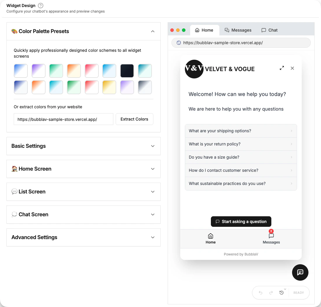
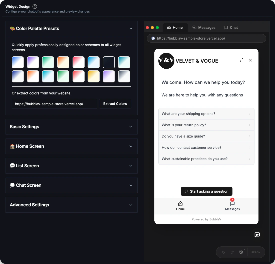
The design settings are organized into collapsible sections to help you focus on specific parts of the widget.
### 🎨 Color Palette Presets
Choose from professionally designed color themes if you want a quick start.
**Automatic Color Detection**: When you add a new website, BubblaV automatically analyzes your site's colors and applies a matching theme to your widget.
**Manual Color Extraction**: You can also extract colors from any website URL:
1. Expand the **Color Palette Presets** section
2. Enter a website URL in the text field at the bottom
3. Click **Extract Colors** to analyze and apply the color scheme
***
## Basic Settings
Configuration for the widget's general behavior and appearance.
### General
* **Show Expand Button**: Allow users to expand the chat widget to a larger size.
* **Show "Powered by" branding**: Toggle the BubblaV branding (available on Pro+ plans).
### Dimensions
Customize the size of the widget window:
* **Widget Width**: Default is `400px`.
* **Widget Height**: Default is `650px`.
### Bubble Appearance
Customize the floating chat button:
* **Bubble Color**: The background color of the chat button.
* **Bubble Icon Color**: The color of the icon inside the button.
### Positioning
Choose where the chat button appears on Desktop and Mobile:
* **Bottom Right**: Standard convention.
* **Bottom Left**: useful if you have other widgets on the right.
***
## Screen Configuration
The widget is divided into three main screens, each with its own customization options.
### 🏠 Home Screen
The first screen users see when they open the widget.
* **Welcome Message**: The greeting text displayed at the top.
* **Background Style**: Solid color or gradient.
* **Chat Suggestions**: Quick-start questions to guide users.
### 💬 List Screen (Messages)
The screen displaying the history of conversations.
* Customize the title, background colors, and unread indicator settings.
### 💭 Chat Screen
The active conversation interface.
* **Bot Identity**: Set the Bot Name and upload a custom Avatar.
* **Colors**: Customize message bubbles (User vs Bot), text colors, and the input area.
* **Placeholder Text**: The text shown in the message input field before typing.
***
## Advanced Settings
### Exclude URLs
Prevent the widget from appearing on specific pages:
1. Expand the **Advanced Settings** section.
2. Enter the URLs where you want to hide the widget (one per line).
3. You can use specific paths like `/checkout` or full URLs.
### Product Card Layout
Control how product cards are displayed in chat responses:
**Vertical Layout** (default):
* Product cards stack vertically.
* Each card takes full width.
* Best for detailed product information.
**Horizontal Layout**:
* Product cards display side-by-side (carousel).
* Users can scroll horizontally to see more products.
* Compact view, good for showing multiple options.
***
## Live Preview
The design page includes a real-time preview:
* **Desktop view**: See how it looks on larger screens.
* **Mobile view**: Toggle to see mobile responsiveness.
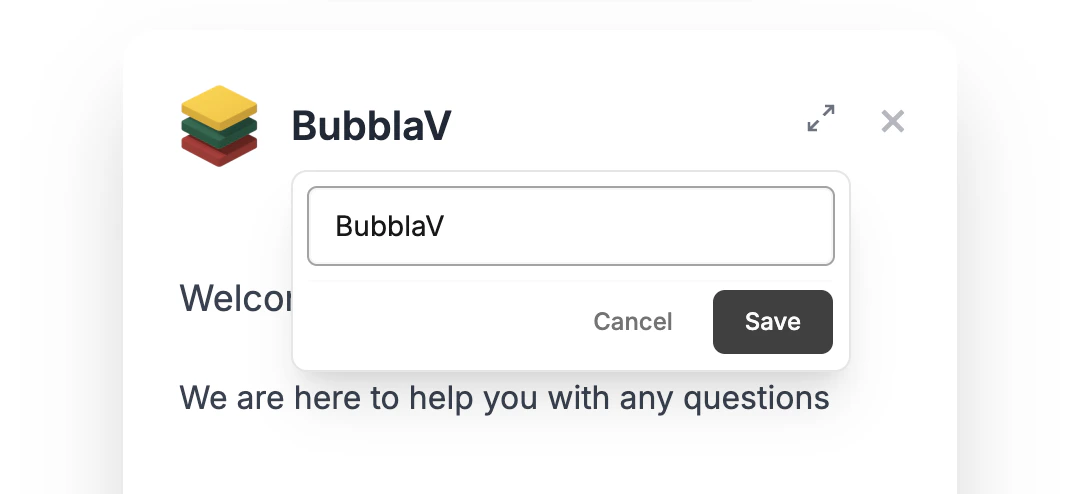
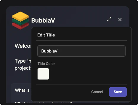
* **Inline Editing**: Click on any text, button, or color in the preview to edit it directly.
***
## Design Options
The design settings are organized into collapsible sections to help you focus on specific parts of the widget.
### 🎨 Color Palette Presets
Choose from professionally designed color themes if you want a quick start.
**Automatic Color Detection**: When you add a new website, BubblaV automatically analyzes your site's colors and applies a matching theme to your widget.
**Manual Color Extraction**: You can also extract colors from any website URL:
1. Expand the **Color Palette Presets** section
2. Enter a website URL in the text field at the bottom
3. Click **Extract Colors** to analyze and apply the color scheme
***
## Basic Settings
Configuration for the widget's general behavior and appearance.
### General
* **Show Expand Button**: Allow users to expand the chat widget to a larger size.
* **Show "Powered by" branding**: Toggle the BubblaV branding (available on Pro+ plans).
### Dimensions
Customize the size of the widget window:
* **Widget Width**: Default is `400px`.
* **Widget Height**: Default is `650px`.
### Bubble Appearance
Customize the floating chat button:
* **Bubble Color**: The background color of the chat button.
* **Bubble Icon Color**: The color of the icon inside the button.
### Positioning
Choose where the chat button appears on Desktop and Mobile:
* **Bottom Right**: Standard convention.
* **Bottom Left**: useful if you have other widgets on the right.
***
## Screen Configuration
The widget is divided into three main screens, each with its own customization options.
### 🏠 Home Screen
The first screen users see when they open the widget.
* **Welcome Message**: The greeting text displayed at the top.
* **Background Style**: Solid color or gradient.
* **Chat Suggestions**: Quick-start questions to guide users.
### 💬 List Screen (Messages)
The screen displaying the history of conversations.
* Customize the title, background colors, and unread indicator settings.
### 💭 Chat Screen
The active conversation interface.
* **Bot Identity**: Set the Bot Name and upload a custom Avatar.
* **Colors**: Customize message bubbles (User vs Bot), text colors, and the input area.
* **Placeholder Text**: The text shown in the message input field before typing.
***
## Advanced Settings
### Exclude URLs
Prevent the widget from appearing on specific pages:
1. Expand the **Advanced Settings** section.
2. Enter the URLs where you want to hide the widget (one per line).
3. You can use specific paths like `/checkout` or full URLs.
### Product Card Layout
Control how product cards are displayed in chat responses:
**Vertical Layout** (default):
* Product cards stack vertically.
* Each card takes full width.
* Best for detailed product information.
**Horizontal Layout**:
* Product cards display side-by-side (carousel).
* Users can scroll horizontally to see more products.
* Compact view, good for showing multiple options.
***
## Live Preview
The design page includes a real-time preview:
* **Desktop view**: See how it looks on larger screens.
* **Mobile view**: Toggle to see mobile responsiveness.
* **Inline Editing**: Click on any text, button, or color in the preview to edit it directly.
 For a full-screen testing experience, use the dedicated **Test** page available in the dashboard sidebar. This allows you to test the chat behavior without the design tools cluttering the view.
### ⚡ Inline Editing
The fastest way to customize your widget is by clicking on elements directly in the live preview.
* **Text Editing**: Click on titles, labels, or names to edit them in-place.
* **Color Picking**: Click on any colored area (like the header or bubble) to open the color picker.
* **Images**: Click on the bot avatar or logo to update their URLs.
* **Layout Toggles**: Switch between product card layouts by clicking on the cards.
Clicking on an element opens an inline editor. Make your changes and click **Save** to apply them, or **Cancel** to revert.
***
## Saving Changes
Inline edits are saved to your history as you confirm them. You can use Undo/Redo to manage changes.
Sidebar changes are not live until you save!
Check your changes in the live preview.
Click **Save** at the bottom of the form.
Reload your website to see the updates — changes appear within 1 minute.
***
## Design Best Practices
Your brand colors are automatically extracted when you add a website. You can also manually extract colors from any URL in the Color Palette Presets section, or set your primary brand color for the Bubble and User Messages manually.
Ensure high contrast between text and background colors. Dark text on light backgrounds is generally the most readable.
If you enable the **Expand Button**, check that the larger widget size doesn't cover important content on your site.
Customize the **Welcome Message** on the Home Screen to sound friendly and helpful.
***
## Troubleshooting
* Ensure you clicked **Save**.
* Reload the page — changes appear within 1 minute.
* If still not showing, clear your browser cache and reload.
* Try changing the **Positioning** (Left vs Right).
* Use **Advanced Settings > Exclude URLs** if it shouldn't appear on certain pages.
***
## Next Steps
Preview your chatbot in action
Add the widget to your website
For a full-screen testing experience, use the dedicated **Test** page available in the dashboard sidebar. This allows you to test the chat behavior without the design tools cluttering the view.
### ⚡ Inline Editing
The fastest way to customize your widget is by clicking on elements directly in the live preview.
* **Text Editing**: Click on titles, labels, or names to edit them in-place.
* **Color Picking**: Click on any colored area (like the header or bubble) to open the color picker.
* **Images**: Click on the bot avatar or logo to update their URLs.
* **Layout Toggles**: Switch between product card layouts by clicking on the cards.
Clicking on an element opens an inline editor. Make your changes and click **Save** to apply them, or **Cancel** to revert.
***
## Saving Changes
Inline edits are saved to your history as you confirm them. You can use Undo/Redo to manage changes.
Sidebar changes are not live until you save!
Check your changes in the live preview.
Click **Save** at the bottom of the form.
Reload your website to see the updates — changes appear within 1 minute.
***
## Design Best Practices
Your brand colors are automatically extracted when you add a website. You can also manually extract colors from any URL in the Color Palette Presets section, or set your primary brand color for the Bubble and User Messages manually.
Ensure high contrast between text and background colors. Dark text on light backgrounds is generally the most readable.
If you enable the **Expand Button**, check that the larger widget size doesn't cover important content on your site.
Customize the **Welcome Message** on the Home Screen to sound friendly and helpful.
***
## Troubleshooting
* Ensure you clicked **Save**.
* Reload the page — changes appear within 1 minute.
* If still not showing, clear your browser cache and reload.
* Try changing the **Positioning** (Left vs Right).
* Use **Advanced Settings > Exclude URLs** if it shouldn't appear on certain pages.
***
## Next Steps
Preview your chatbot in action
Add the widget to your website